Only 3 clicks to handle every case in the bank
![]()
A COHERENT CONFIGURATION
INTUITIVE INTERFACE
EVERYTHING ONLINE
01. Client
The Santander Bank was founded in 1857 in the Spanish city of the same name. It is the second largest bank in the euro zone and the twelfth largest in the world in terms of capitalisation.
The core business of the Santander Group is retail banking, which generates 74% of profit.
Since the beginning of its existence in Poland, the Bank has been placing great emphasis on the ergonomics of electronic banking and providing its customers with easy access not only to new products, but also to after-sales service.
Our job was to simplify access to the case sought by the client and efficiently direct him to the communication channel which is the most favorable for the given case. According to Capgemini's report from 2018, the most important factor in choosing electronic banking is its ease of use and intuitive access to the services provided. Guided by this determinant, Santander focused on Customer Journey optimization with respect to improving the ergonomics of its retail banking.
Challenge
Our job was to simplify the access to the case searched for by the client as much as possible and to efficiently direct the client to the communication channel that is most convenient for the given case. According to Capgemini's report from 2018, the most important factor in choosing electronic banking is its ease of use and intuitive access to the services provided. Guided by this determinant, Santander focused on Customer Journey optimization with respect to improving the ergonomics of its retail banking.
02. Solution
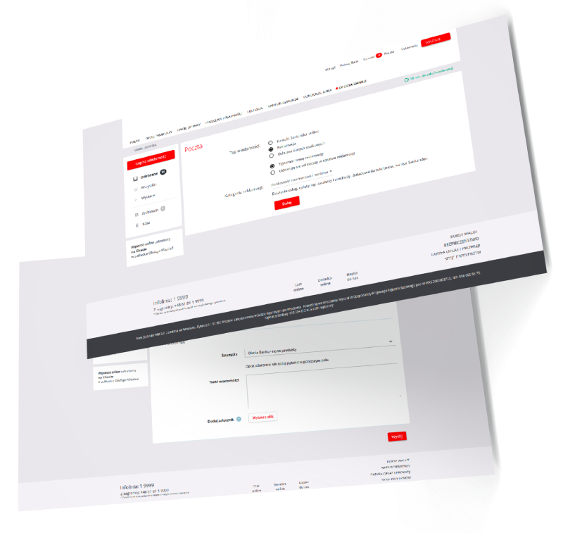
In the new solution, after logging in to the electronic banking, the customer is moved to the New Customer Service Zone - an application which is a central banking point from which it is easy to go to handle any case in the bank. The customer can see all the topics grouped into clear sections, and after selecting a given case, the system suggests which communication channel to use to handle it most efficiently. Available channels for a given type of case can be configured by the bank on its own.
The client also has a Mail 2.0 tool and a search engine at his disposal which, after entering a few characters from the name of the case, will suggest matching possibilities.

Clients love Santander
Clients love Santander
też polecam Santander, miałam 3 inne banki przed i Santander mi się właśnie najlepiej sprawdza
— D-43?promyczek yongguka (@oddhw216) September 5, 2019
ja polecam santander, wszystko fajne i wygodne
— ☾ダリ (@orphichoneypie) January 16, 2019
03. Results
Thanks to the implementation, the banking client can search for and start dealing with every case with 3-4 clicks. The interface, which the customer has received, is more intuitive and structured.
The bank links to all cases from one place, which results not only in simplification of website management, but also in a coherent system of configuring a catalogue of available functions.
The number of call-center calls has also decreased - not only those related to the request for assistance in finding the desired function, but also complaints, because the customer can more easily submit them online (as a self-service tool).

